
Brisbane Powerhouse
What was once the engine room of the largest electric tram network in the Southern Hemisphere and later a site for Army target practice is now one of Australia’s best live performance venues, foodie hangout, and wedding venue. The Brisbane Powerhouse is unmissable as it lights up the New Farm bend of the river with laughter, music, acrobatics and art so it was a huge honour when they approached Patch Creative to illustrate the cover art for their entire year of programming.
Summer Cover
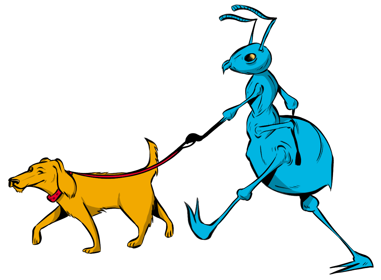
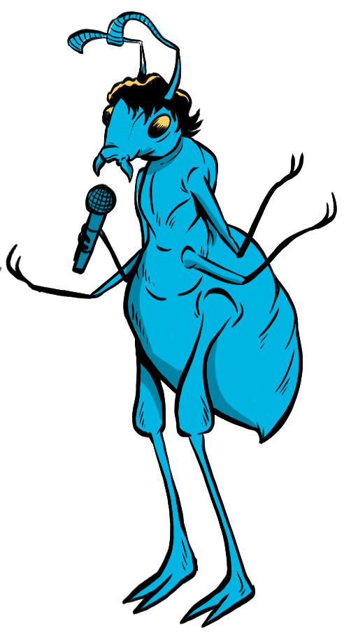
Taking inspiration from each season and the performers who would be gracing the stage we set about getting the Summer and Autumn editions looking schmick. Summer in New Farm Park means lots of picnics, cool breezes off the river, barbeques and ants, many, many ants. Brisbane Powerhouse relied on our creative insight to develop the illustration concept and we worked with the dedicated Powerhouse colour palette for each season, which included a delicious addition of Pantone fluro lettering. Quirky nods to the Summer performers like an ant at a Piano who has a strong resemblance to Amanda Palmer and cheeky ants swinging from a Christmas tree were fun inclusions for those eagle-eyed fans out there.


Autumn Cover
The Autumn program cover illustration centred around the Brisbane Comedy Festival so to have a bit of fun we created an image of a tower of TV’s with cables hanging out and a motley crew of dogs laughing around the bottom of it just to add a bit of ridiculousness. We worked with the Brisbane Powerhouse’s colour palette again and also brought in some hand-lettering to give it a bit of a bespoke edge. Those graphics were then used across the whole site on external billboards, posters and as decals inside the building.


Colourful Edge to Physical Distancing
As 2020 became the year of lockdowns it eventuated that the Powerhouse had no need for the next two seasons of program illustrations yet they wanted to continue to collaborate with us on some other exciting projects. To add a colourful edge to physical distancing the Powerhouse used our illustration of a dog-walking ant as floor decals to keep people safe. We also created three unique backgrounds for the team to use during their working-from-home Zoom meetings to add a bit of humour and sparkle to their day.
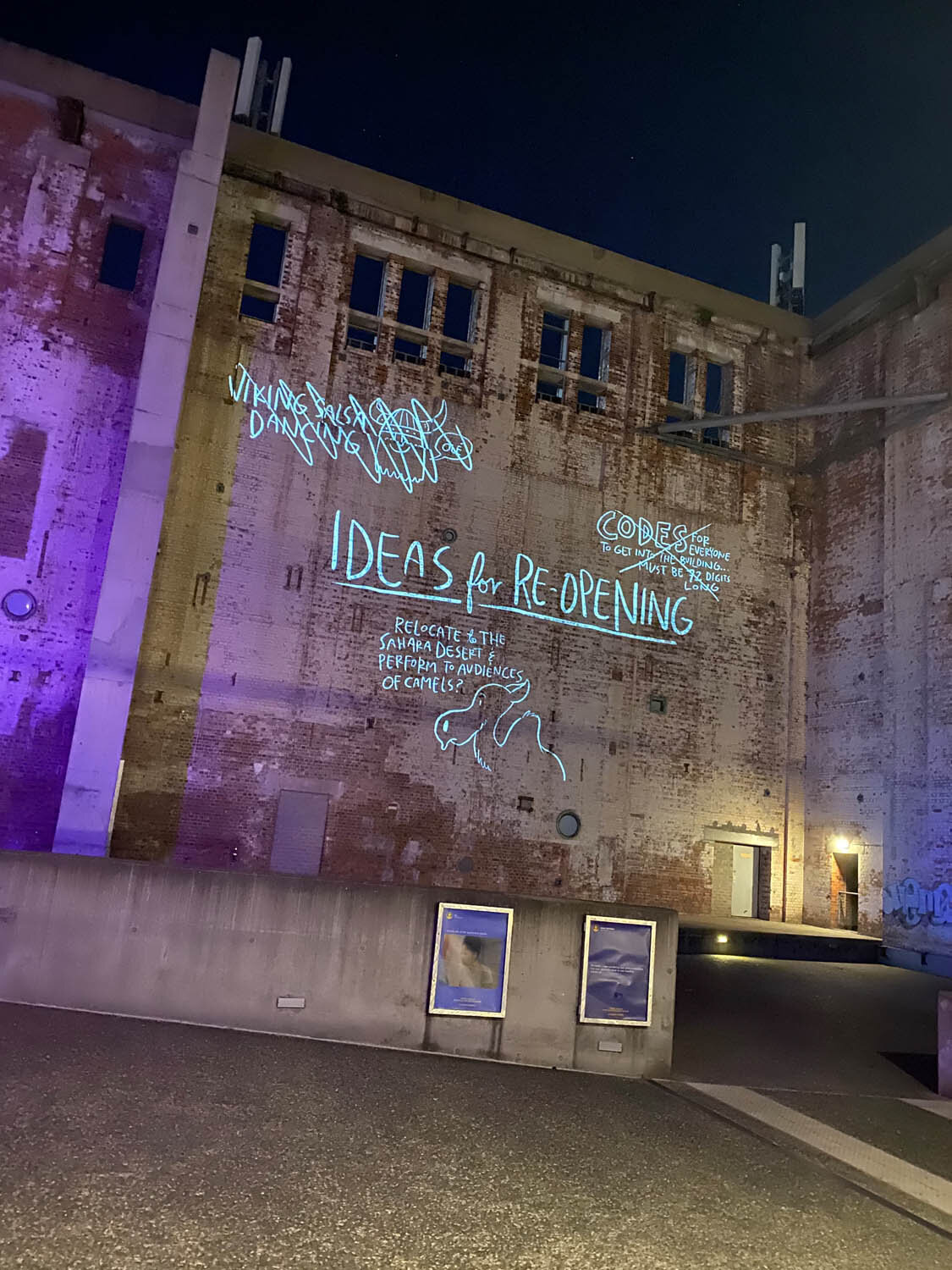
Ideas for Reopening
As it looked as though the sun was starting to peek through the grey clouds of lockdown and the venue could open their doors again we were commissioned to create an animation to be projected across the exterior walls of the iconic structure to catch the attention of dog-walkers and enthusiastic boot-campers who were trickling back to New Farm Park. With the Powerhouse crew telling us, “We’ve got a projector, we want you to animate something on the wall, what do you want to do?” The spirit of tomfoolery came through loud and clear with the blackboard brainstorming session of how to reopen the Brisbane Powerhouse. The animation was projected onto one of the Powerhouse’s huge exterior walls and included such genius ideas as, “Relocate to the Sahara Desert and perform to audiences of Camels” and “Fabric. Just lots of fabric… everywhere”. We had fun with this celebration of reopening the venue while everyone still feels a sense of having no idea what to do or how to deal with the rest of the year, capturing the essence of, “Well anything could happen, so why not?”
Continuing on with the projection idea we have been working on some very fun and of course quirky gobo projections of the ‘Powerhouse Pets’ to be spotlights across the footpath down to the Brisbane River. It’s exciting for us to be working with the gobo technology and lots of lighting effects and we’re really hoping that it will bring people rushing back to the Powerhouse.


Powerhouse Pets
Powerhouse Pets is a projected exhibition of animal illustrations between the New Farm Ferry Terminal and the Brisbane Powerhouse. The art direction for the body of work was to have the subject presented as if it is looking up at you under a spotlight, in manner that makes you feel as if it is interacting with you.
Designing for light was an interesting experience presenting challenges for artist, Jimmy Patch. Jimmy created each character accommodating the complexity of shadow and the emptiness black cause in the projection, as well as choosing a colour palette that ‘popped’ and didn’t fade out with the light.
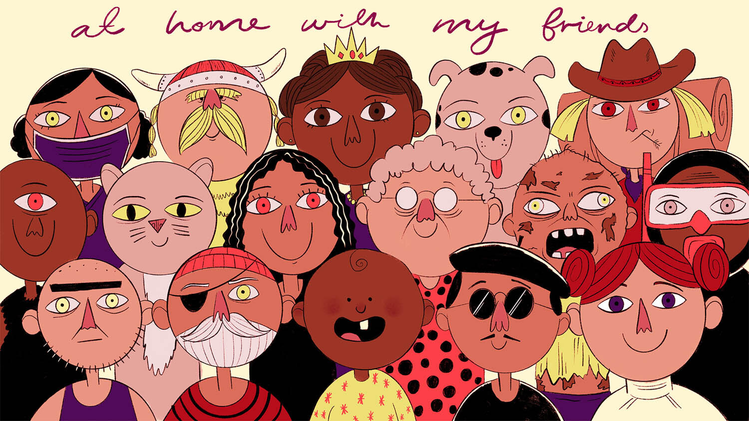
The importance of public artworks offers the community a different way to engage with the environment and any new concept. This kind of creative contribution to community is something we are passionate about here at Patch Creative.